A FRACTURED “BRAND”
Executive Director Ryan Ripperton introduced the Fraternity’s new visual identity in a surprise presentation at the 2006 National Convention Awards Gala.
If asked to draw or write the Fraternity’s name and identifying imagery on a sheet of paper, Sinfonians could have any one of virtually countless impressions come to mind�everyone thinks of different combinations of words and images when thinking of the Fraternity.
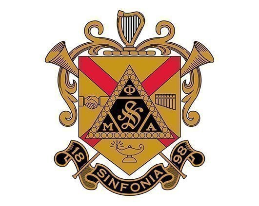
Some think of the Greek letters sometimes coupled with the word “Sinfonia” and sometimes not. Others think of the Coat-of-Arms. Still others think of the old “Sinfonia Fraternity” image taken from the early chapter charters. Even the image of the interlocking Greek letters might come to mind due to its use in the late 1990s and early 2000s (including on the front cover of Themes for Brotherhood).
As you can see, we have more variations on our visual identity than we know what to do with. Each of these symbols is good, but for many years we have lacked one clear, consistent way to represent our Fraternity and to communicate our message through our overall “brand.”
DEVELOPMENT OF A VISUAL IDENTITY
Working with Indiana-based Richard Harrison Bailey/The Agency, a creative marketing communications firm known as “RHB,” the Fraternity undertook the daunting task of bringing itself into consistent use of one coherent brand.
Phi Mu Alpha Sinfonia’s new wordmark
The new typestyle reflects the artistic environment of the Fraternity.
Our new typestyle for the Fraternity’s name communicates an environment of artistry an antique hand with a classic balance of curves and edges. It is a customized typeset even with the correct fonts, it cannot be duplicated on a desktop computer, thereby encouraging the consistent use of camera-ready artwork available from the Fraternity’s National Headquarters.
Phi Mu Alpha Sinfonia’s new lyre imageThe cornerstone of our new visual identity is the lyre. It alludes to lyres of more historic emblems, but brings them into a modern focus, reminding us that the lyre will never fade with time. As a prominent feature of our visual identity, it serves as a constant reminder of the central focus of our Order’s music.
Also featured in our new visual identity is a tagline that encapsulates the Fraternity’s culture and mission in a way perhaps unmatched in the history of the organization: “Among Men Harmony.” The dual inference to brotherhood and music in this phrase is clear and thought-provoking, and reflects language used since the very earliest days of Sinfonia’s existence. As Ossian Mills wrote:
“Harmony is ever to be the noble aim of our beloved society, harmony not only in music, but in the life within the fraternity, and in the broader and fuller life beyond its portals; it is the harmony whose music is felt in the hearty handclasp, heard in the cheerful greetings, seen in living notes in the generous act.”
So, piecing together the three elements of our brand presence (our name, logo and tagline) brings into focus a visual identity which will mean so much to us as Sinfonians, while at the same time communicating so much about us to those unfamiliar with our organization.
CONSISTENT USE OF OUR NEW VISUAL IDENTITY
This visual identity will be the standard usage for the Fraternity’s name in printed documents where a definitive visual brand is appropriately used. Any organization seeking to advance its “brand” recognizes that the value of a brand is limited to the extent that it is used consistently and that it is clearly recognizable to the organization’s “public” (in our case, both members and non-members).
Phi Mu Alpha Sinfonia’s new Visual Standards ManualOur visual identity has been developed to communicate a consistent, purposeful direction for the Fraternity. In order for it to be successful, every chapter, province and alumni association is encouraged to use it frequently and prominently, but consistency is of paramount importance. For this reason, RHB created for us a Visual Standards Manual, which will be available for download on the Fraternity’s website in early September. This
Manual covers:
- the regulations on how to use this image and its related variants
- instructions on how to continue using the Greek letters and other common representations in a way that will be consistent with this visual identity
- ideas and suggestions on common graphical or layout mistakes that can dilute the power of a consistent, coherent branding campaign.
Members and chapters can help in the success of our re-branding campaign! Access is available to the official computer graphic files, located under “Images” in the Resources area of sinfonia.org or by clicking here.
Additionally, chapters, provinces and alumni associations are able to request customized graphic files from the National Headquarters that conform with the standards set forth in the Visual Standards Manual. These images can be accessed under “Images” in the Resources section of sinfonia.org, or by clicking here. Examples of such images are as follows:
- Chapter lock-up with visual identity
- Chapter lock-up with Greek letters and ‘Sinfonia’ Chapter lock-up with Greek letters
SO WHAT’S NEW, AND WHAT’S STILL THE SAME?
Here’s what’s new:
The typestyle of the name “Phi Mu Alpha Sinfonia” and the newly designed lyre logo.
The tagline “Among Men Harmony.”
How the Fraternity will use our specific shades of red, black and gold in print.
Guidelines for Fraternity imagery as outlined in the Visual Standards Manual.
Here’s what’s still the same:
The Coat-of-Arms, pin design, and Greek letters are all still official images of the Fraternity and are acceptable to use as appropriate.
Other slogans of the Fraternity, such as “Once a Sinfonian…” and “Work for Sinfonia…” are still acceptable to use as appropriate.
Greek letter apparel, such as sweatshirts, jerseys, hats, etc., needn’t conform to the specific typestyle shown above.
In the coming year, the Fraternity will continue to roll out new and innovative communications that will add to the value of our lifelong, fraternal bond of HARMONY.